Concept & Idea
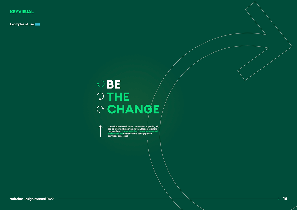
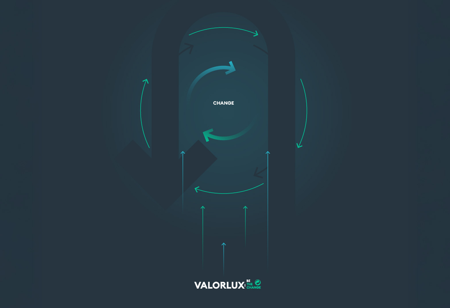
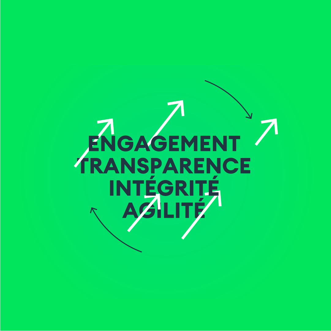
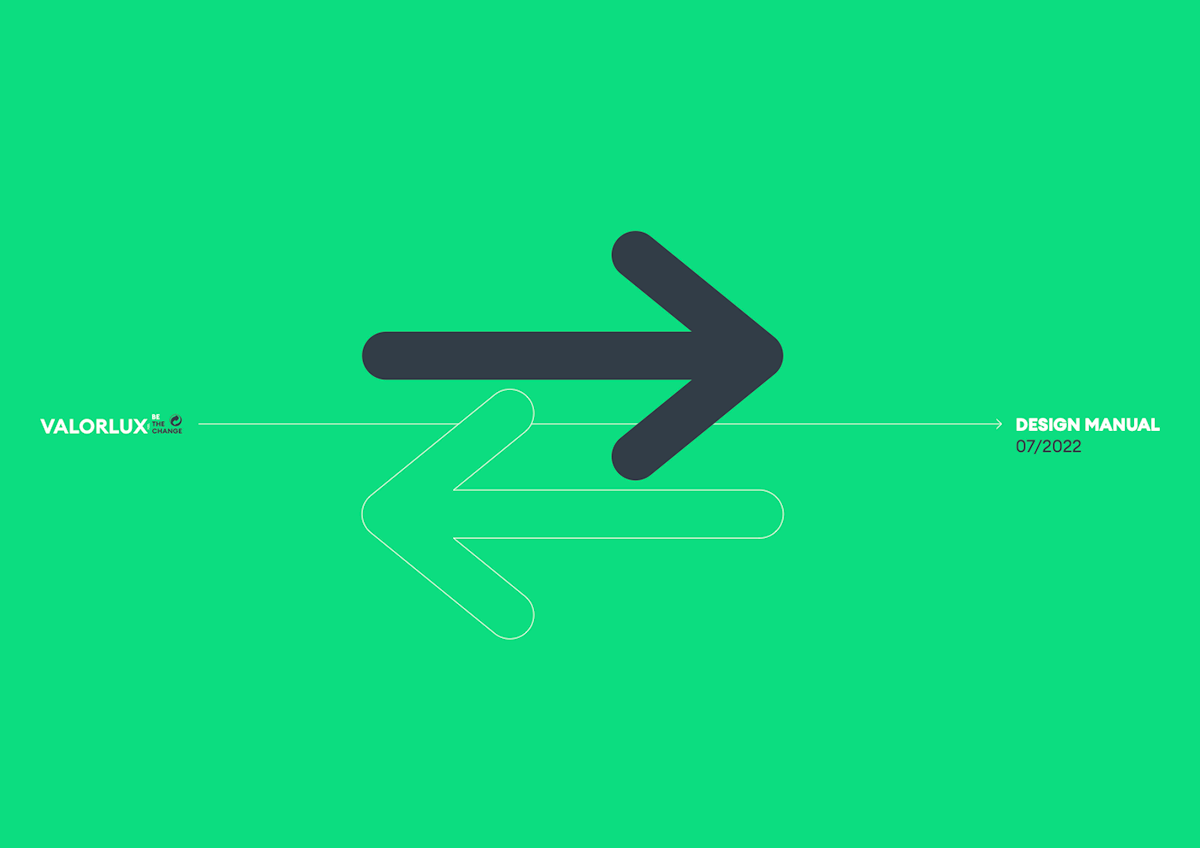
The project is built around a simple but powerful idea: change as a continuous, circular process.
Inspired by the principles of the circular economy, the visual language translates sustainability into movement, direction, and flow—making the abstract idea of recycling tangible, understandable, and actionable.
Rather than relying on didactic messaging, the concept invites people to see themselves as part of the cycle: every action matters, every gesture contributes to change.
Visual System
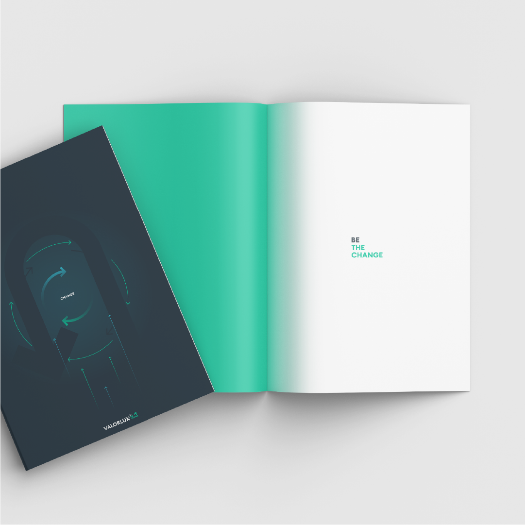
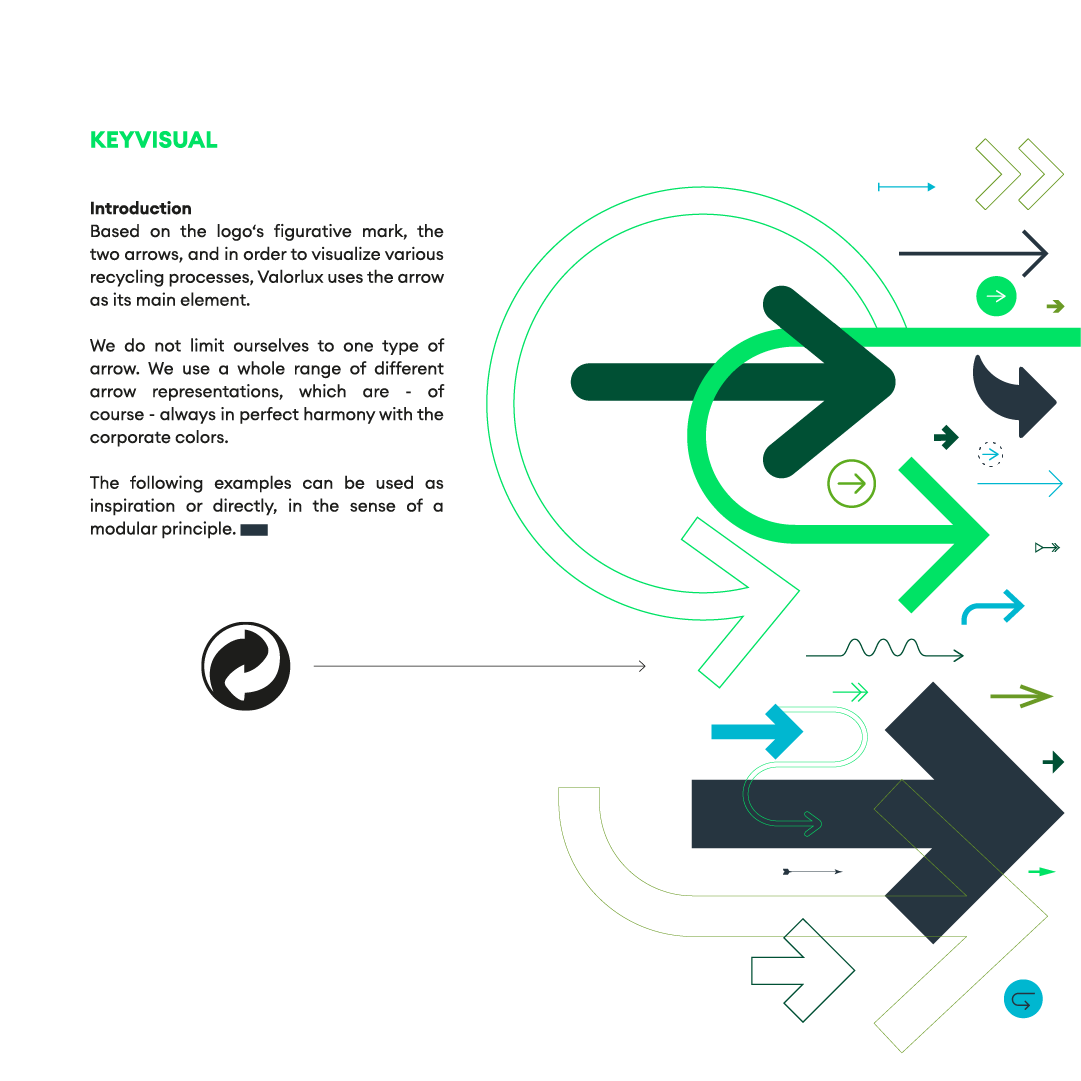
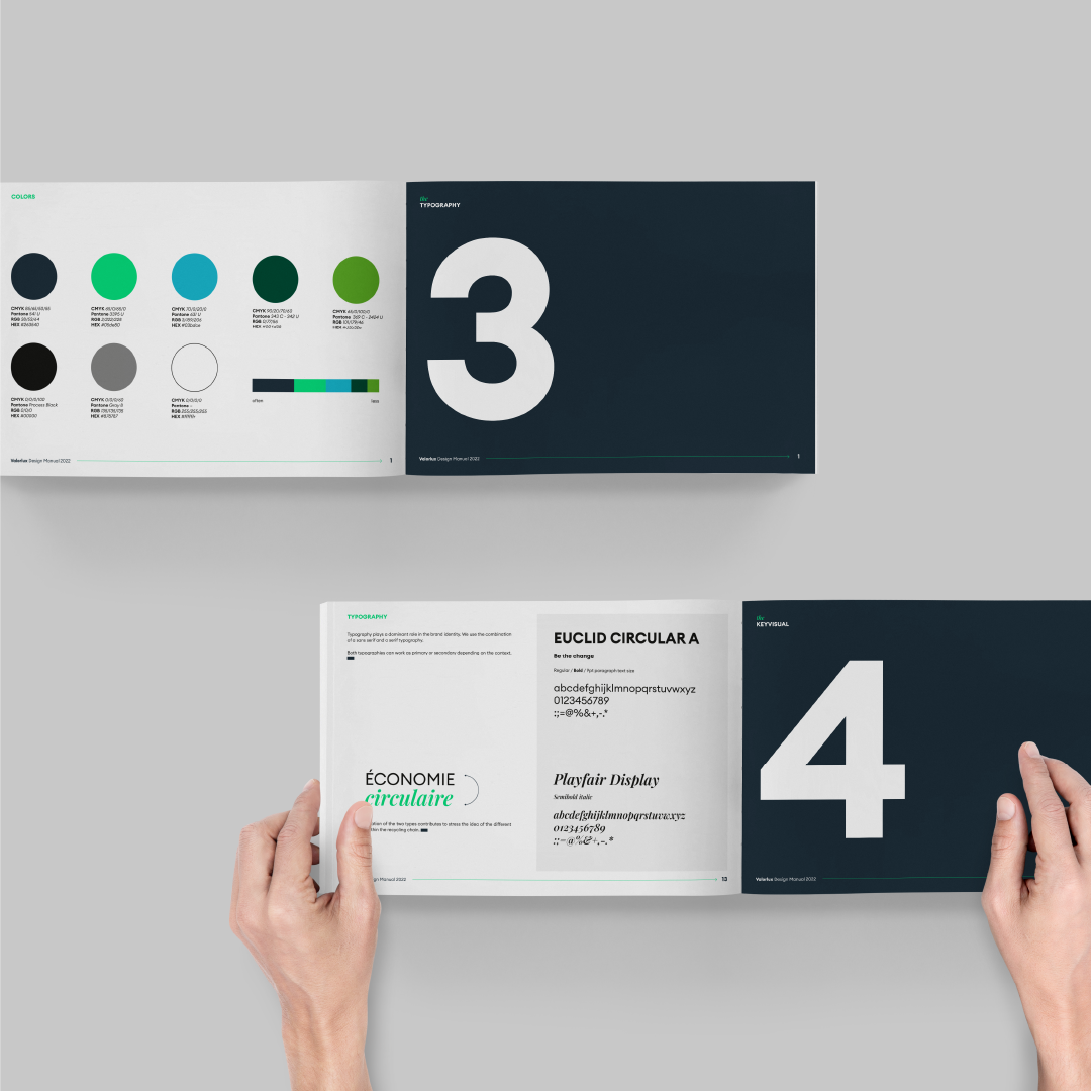
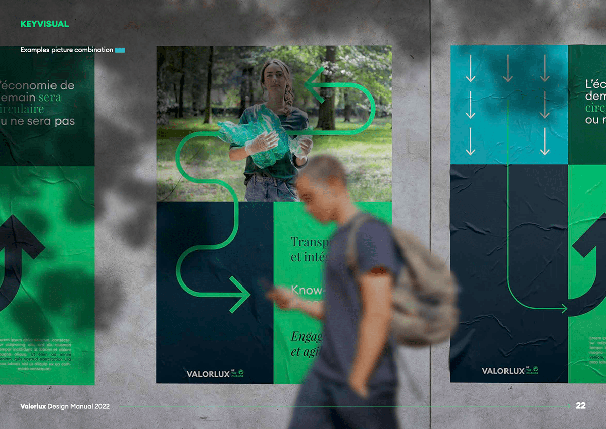
The visual system is driven by arrows, curves, and circular paths, symbolizing transformation, continuity, and progression. These graphic elements function as both narrative devices and structural components, guiding the eye and reinforcing the idea of constant movement. Bold color contrasts—deep greens, vibrant teals, and dark neutrals—anchor the system in nature while giving it a contemporary, confident tone suitable for large-scale communication.

Typography & Identity
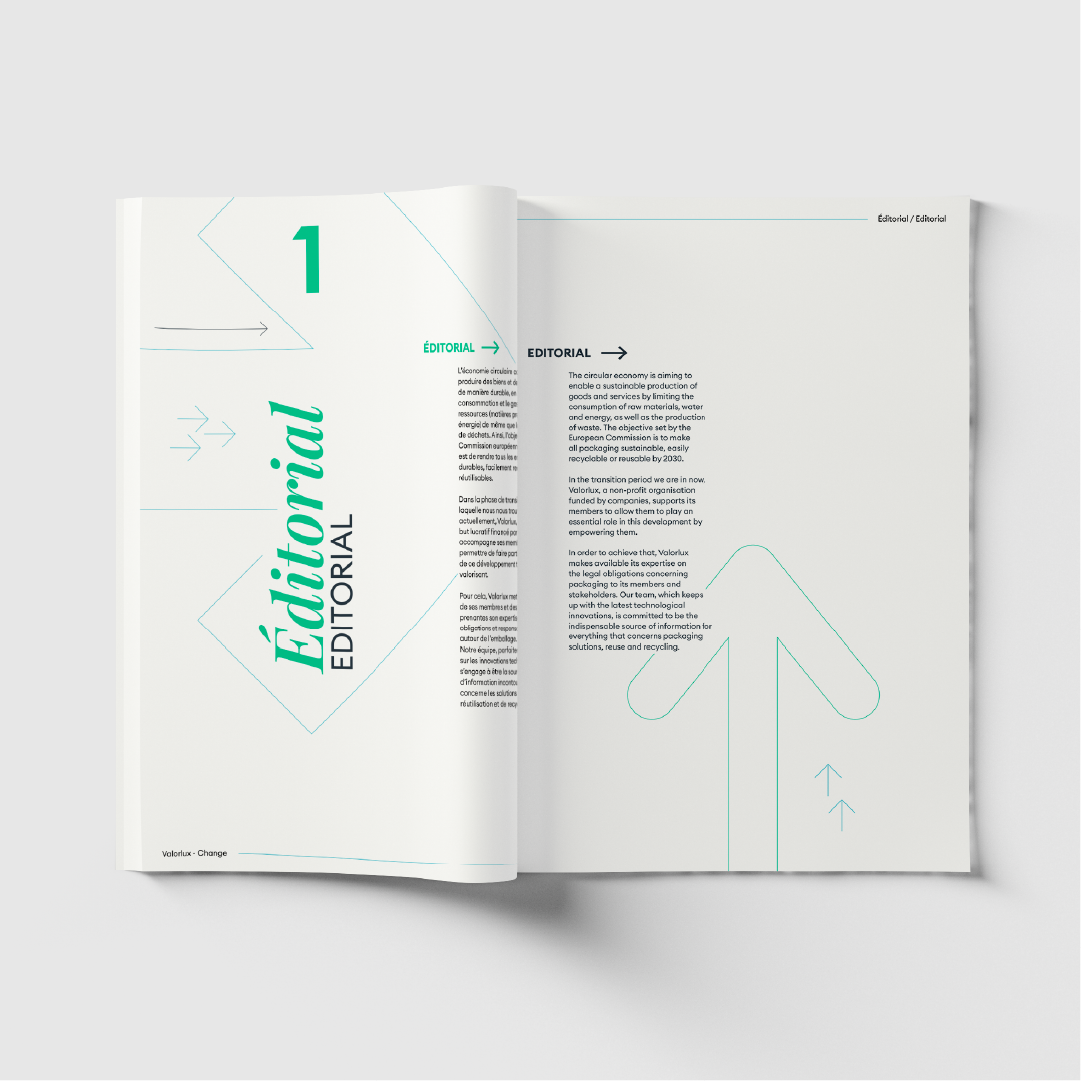
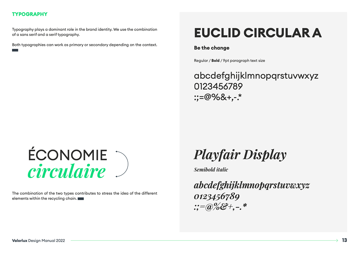
Typography plays a key role in balancing clarity and expression. A sans-serif typeface ensures legibility and directness, while a serif counterpart introduces contrast and nuance—echoing the diversity of elements within the recycling ecosystem.
Together, typography and graphic elements create a flexible identity system designed to adapt across formats while remaining instantly recognizable.
Applications & Impact
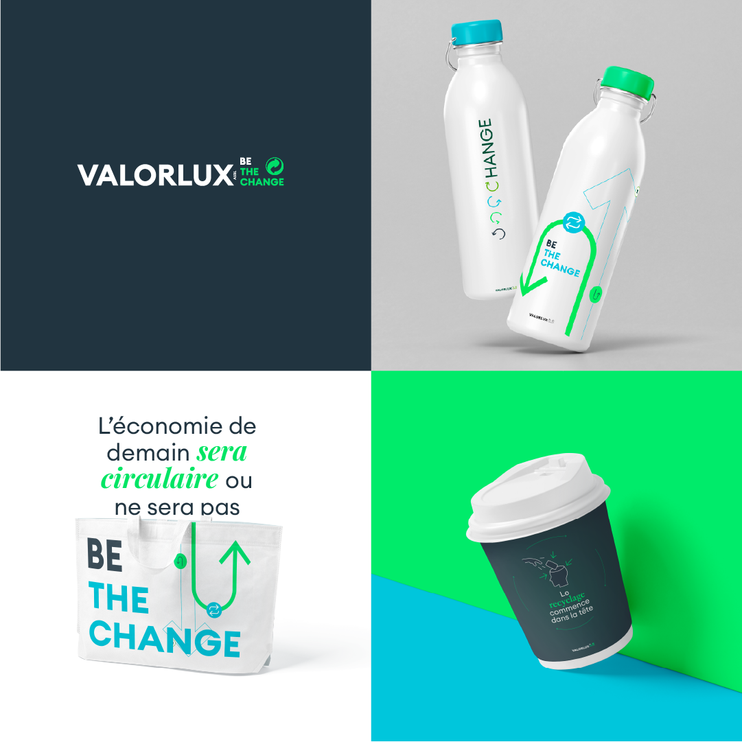
The system was designed to scale seamlessly across multiple touchpoints, from posters and public communication to objects and branded materials.
Photography and graphic overlays work together to connect real-life actions with abstract principles, reinforcing the message that sustainability starts with everyday choices.
The result is a cohesive visual language that supports Valorlux’s mission: to simplify recycling behaviors and encourage collective responsibility through clear, engaging communication.